
Friday 24 November 2017
Monday 20 November 2017
Environment and Colour Design

With this piece of work, my plan was to get a better sense of the scale and colour of the environment, my plan is for zone 3000 to be a maze of buildings surrounded by water. Below is a quick colour key of a specific scene in the animation. I wanted the ominous, reddish-pink glow of the island's holographic sign to always be present within most scenes to give a subtle hint towards the danger C-13 is facing. As opposed to previous concepts and colour designs I have decided to crank up the saturation to give the film a more garish look.

Monday 13 November 2017
Friday 10 November 2017
Creating A Colour Script

My main goal with this was to see how the colours I have chosen work with one another and how they change the tone/mood of specific scenes.
I feel that it has worked and I enjoy both the vibrance and the darkness of each scene.
Below are larger images of the colour script.


Tuesday 7 November 2017
C-13 Character Development
Since my last design post I have been working on my main, and only character, C-13. Below is the first page of development.
 Whist working on this page of designs I was trying to figure out the shape of my character. I like my characters to be bold shapes that are nice to look at and will be fun to animate in the future.
From the set of body designs my favourite was No.3 because I liked the torso being quite round like a ball, so when it comes to animating I like having the sense of his body being a bouncy ball.
I also played with the idea of C-13 having a mouth. I liked it, but I didn't feel that I needed or wanted the character to have one, my reason for this was I felt that with the animation being a silent film, driven by diegetic and non-diegetic sounds, I wanted to get across the emotion of the character through his eyes and body language. So from this I developed it further into C-13's final concept.


Monday 6 November 2017
'Escape Zone 3000' Robo-Shark Scene (Updated)
Like my previous version of this scene, the goal is to get a sense of pacing, Alan suggested that the previous video was too linear. This time I have created two different versions which are similar but are cut differently. I feel that I prefer version one, as seen above.

Sunday 5 November 2017
Designing The Titles
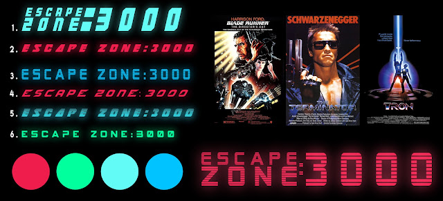
In my previous design post I showed early designs for the titles of my animation. The look will be inspired by 1980's movie titles but will tie in with the overall design of the story itself. Below are a set of new designs. A comment I got from phil was to maybe take away the colon from one of the designs I had done, the new take on this idea can be seen as number 1. in the concepts below.
 For me, there are a few that stand out, 7, 8 and 9. Personally, I feel number 9 stands out because when looking at it, it has the look of a floor pan for a building/maze and the way in which it is boxed in acknowledges the characters confinement. Also, I wanted to try out a neon light look as this is already a factor in the design work for the environments (the neon arrows). Feedback for these designs is welcome.
 For me, there are a few that stand out, 7, 8 and 9. Personally, I feel number 9 stands out because when looking at it, it has the look of a floor pan for a building/maze and the way in which it is boxed in acknowledges the characters confinement. Also, I wanted to try out a neon light look as this is already a factor in the design work for the environments (the neon arrows). Feedback for these designs is welcome.
 Wednesday 1 November 2017
Designing 'Escape Zone 3000'
For my animation I've always had a sense of how I want it to look, The character, who is now known as C-13 (inspired by a Buster Keaton movie called 'Convict 13') being the aspect I have looked at the most. Below are my initial scribbles trying to find something from the rubble of drawings.


The picture above is, in a way, an evolution of the character from the first doodles on the left to the newest on the right. From here I began to develop a particular sketch that I liked, as seen below.

What I liked most about this design was it's simplicity, which is something that I was aiming for. There is also a sense of the Kubrick in the sketches within the shape of the head.
I was also looking at Marvin the Martian when it came to the actual facial features or lack of, I liked the idea of the eyes looking like they were floating in the middle of this head.
He currently has no mouth, which I am still not sure about, however, I was thinking of giving him a small L.E.D screen mouth, which I may still do when I take these designs further.
Next, I moved on to the environment. I have always had the idea that the character and the environment would contrast off of one another. Like many films I wanted to use what could be considered a cliche set of colours, specifically the orange of C-13's suit and the teal/blue of the environment. With this in mind I wanted particular things to stand out, mainly the red, neon arrows that point C-13 in the direction he needs to go, I chose red because of the ominous feel I want the viewer to have. There is also the green of C-13's eyes.

Zone 3000 is an island prison, it's big and in the middle of the sea, there is a bridge that leads in to the building but leading out I want it to seem endless, as if nobody knows where it connects to because nobody has travelled far enough. At the top of the island I plan on having a large holographic sign that revolves above, projecting the ominous, red glow. this is also the case with the designs below, the cell, which is where he begins his journey is illuminated by holographic cell bars.

I also had a look at designing the title, I wanted it to have an 80's vibe, like the rest of the film. I'm drawn towards the design in the bottom right corner of the image below, but looking back I feel there are a couple of others that stand out more. Feedback on this is more than welcome.

With all this in mind, I plan on moving forward with the designs to something more finalised.
Subscribe to:
Posts (Atom)